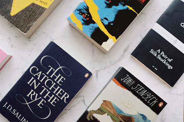
When you publish a translated book—whether from English to German or vice versa—your cover becomes a cross-cultural marketing tool. It needs to speak to new readers while staying true to the original.
But here’s the tricky part: how much should you actually change?
As a professional translator for authors, I often get this question. So in this post, let’s explore what to tweak (and what to keep) when designing a translated book cover—plus what current trends tell us about reader expectations in English- and German-speaking markets.
Why Translated Book Covers Should Look Different
On platforms like Amazon, it’s crucial that readers can immediately distinguish between language editions. If your English and German versions look exactly the same, people may:
- Confuse them and order the wrong version
- Overlook the translated edition entirely
- Leave negative reviews because of the misunderstanding
Even small tweaks can help signal “this is a different edition” at a glance—especially in thumbnail view.
What to Change: Design Elements That Signal a New Edition
While you don’t need to completely redesign the book, consider adjusting:
- Subtitle – Adapt idioms or tone.
- Font styles – Adjust for cultural taste.
- Image composition or background – Swap out imagery.
- Color palette – Use different colors.
- Layout or tagline placement – German words are often longer; spacing may need adjusting.
These changes help your book feel tailored to the new market without losing its identity.
What About the Title?
Here’s where it gets interesting:
- Sometimes, keeping the original (especially English) title is the better choice—especially if it already has recognition or if a translation would sound awkward.
- German editions often keep English titles, particularly in genres like romance or YA, because it gives an international, trendy vibe.
- BUT: If you’re publishing a German translation, you must consider title protection laws. A title already used in Germany—especially if it’s the same genre—might be protected. Always check this before reusing or translating titles. (for more info, check out my blog post Legal Requirements for Publishing in Germany)
What Should Stay the Same?
Some visual identity should carry across versions so that returning readers or fans recognize the book:
- Your author name
- Key branding elements (like series logos or iconography)
- The general mood or tone (dark for thrillers, soft for romances, etc.)
Think of it like designing a sibling cover—not a clone, not a stranger.
Changing Genre Trends: What Sells Now
Design trends are constantly evolving. What worked five years ago might feel dated now. Here are a few genre-specific notes for 2025:
🔥 Steamy Romance & Erotica
- Then: Couples or shirtless male models were standard.
- Now: Many covers resemble fantasy books—moody colors, no models, mysterious vibes.
- Trend: Symbolic covers are gaining popularity, often using illustrated or abstract designs to hint at the story’s tone.
💕 Contemporary Romance
- English market: Bold fonts, character illustrations, pastel palettes.
- German market: Often leans more delicate—floral or seasonal imagery, serif fonts.
🔪 Thrillers
- English: Dark, gritty, high contrast.
- German: Clean typography, cooler tones, often more minimalist.
🧙 Fantasy
- Both markets: Rich detail still works, but German editions may prefer more traditional or subdued styling, while English covers tend to go dramatic.
Quick Tips When Working With a Designer
- ✅ If possible, work with the same cover designer who created the original edition. They already understand your book’s tone and can often advise on what resonates best in both language markets.
- ✅ There’s no rush to design the translated cover too early. In fact, it can be beneficial to wait until the translation is well underway—especially if the title may change. Some translators prefer to finalize the title after the first draft, once they have a full sense of the book’s voice and nuance.
- ✅ Research authors in your genre who have published translated versions in English or German. Look at how they’ve adapted their covers, titles, and design elements for each market—it’s one of the best ways to spot trends and avoid missteps.
- ✅ Make sure your translated cover stands out in thumbnail view, especially on platforms like Amazon. Visual clarity and immediate language recognition are key.
- ✅ Check that your design choices align with current trends in the target market—not just what’s trending in your original one.
Final Thoughts
Designing a translated book cover isn’t just about visuals—it’s about connection. A thoughtful, well-adapted cover helps your book resonate with new readers while distinguishing it from the original edition. Whether it’s subtle font changes, a localized title, or a complete visual refresh, the right decisions can make your translated book stand out—and sell.
If you’re planning to bring your book to a new audience in English or German, I’d love to support you with a high-quality, genre-sensitive translation that fits your voice and your vision.
👉 Get in touch here to learn more about my book translation services.


